 The Refutation
The graveyard · The autopsy
MACD: The Indicator Is a Passenger
The claim on trial
MACD is on every platform, in every course, behind every second chart on social media. Its signals are taught the same way everywhere: go long when the MACD line crosses above its signal line, go short when it crosses below, watch the histogram for early turns, and treat divergence between price and indicator as the highest-quality setup of all.
Before testing any of that, it is worth saying plainly what MACD is. The MACD line is one moving average of price minus another. The signal line is a moving average of that. The histogram is the gap between the two. Every value on the panel is a smoothed, lagged transformation of the same closes you can already see. We have tested this family twice before, as the golden cross and as moving-average ribbons, and it died both times. So we pre-registered the protocol and, with it, four predictions:
- The crosses will be indistinguishable from a coin flip against an honest baseline.
- The histogram will generate far more signals and no more information.
- Divergence will test at zero or worse.
- A trend-filtered version will look genuinely better, and will still fail regime cross-validation, because the filter is doing the work.
Calling the shot in advance matters. A test you design after seeing the data can always be bent until it agrees with you.
How we tested
Three of the largest crypto markets, on every chart speed a trader actually uses, over a sample long enough to span a blow-off top, two bear markets, a bull run, a dead range and a choppy recovery. Fills are honest: a signal can only be acted on after the bar that produced it has closed. Every trade pays a realistic trading cost.
One rule does most of the honest work: a signal is never judged against zero. It is judged against the market's own drift. Markets go somewhere on their own; a bullish signal that "wins 53% of the time" has told you nothing until you know what the market handed out anyway over the same stretch. The gap between those two numbers, the edge, is the only number in this letter that matters. We also make sure no trade is counted twice, and when we test many variants we allow for the fact that some of them must look good by pure chance.
What the signals measured
The crosses. Across every timeframe, the textbook signal-line crosses sit within noise of their baselines. The single best multi-year reading, long crosses on the 1-hour chart, shows an edge of about a tenth of one percent per trade. That is less than a realistic round-trip trading cost. The best version of the flagship signal earns less than it costs to trade.
The histogram. This is the cleanest result we have ever published. The histogram inflection, the "earliest" MACD signal, fires so often that under a year of 5-minute data gave us more than 23,000 independent measurements of it, and six years of hourly data gave us another 14,000. At that sample size the estimate is precise to a few thousandths of a percent, and the edge is zero. Not small. Zero, measured to three decimal places, tens of thousands of times, on two clocks.
The popular refinement does not help either. Traders are taught to act on the colour change: the histogram bottoms out below zero and prints its first rising bar, or tops out above zero and prints its first falling bar. On the 1-hour chart, over six years, both of those taught entries measured slightly negative against their baselines. Fading the colour change would have beaten following it. The half of the inflections nobody teaches, the mid-trend wiggles, measured slightly better than the famous half. The teaching points backwards.
We also ran the full system a chartist actually sees on a weekly chart: long when the histogram bottoms out below zero and prints its first rising bar, short when it tops out above zero and prints its first falling bar, always in the market. On Bitcoin that produced 16 trades in six years. The long trades made +66% while simply holding made +146%. The short trades lost 70%. The short side lost on all three assets, because a falling histogram above zero is usually a bull market catching its breath, and the system sells straight into it. And 16 trades in six years is a sample on which nothing could ever be proven anyway. The timeframe where the pattern looks cleanest to the eye is the one where it can never be verified.
The divergence trap
Divergence deserves its own autopsy, because it produced the most seductive number in the whole study, and that number is a lesson.
In the full-history scan, bearish divergence on the 1-hour chart showed a positive edge strong enough to clear the bar most backtests call "statistically significant". In most published work, that line becomes a strategy. Here is what it became under scrutiny. The same signal on the 4-hour chart pointed the wrong way, by a similar margin. A real effect does not reverse when you change the sampling rate. And walked forward over the most recent 249 days, a period in which Bitcoin fell 37%, the friendliest conditions a bearish signal will ever see, the trade lost money on all three assets and performed no better than shorting at random moments through the identical exit rules.
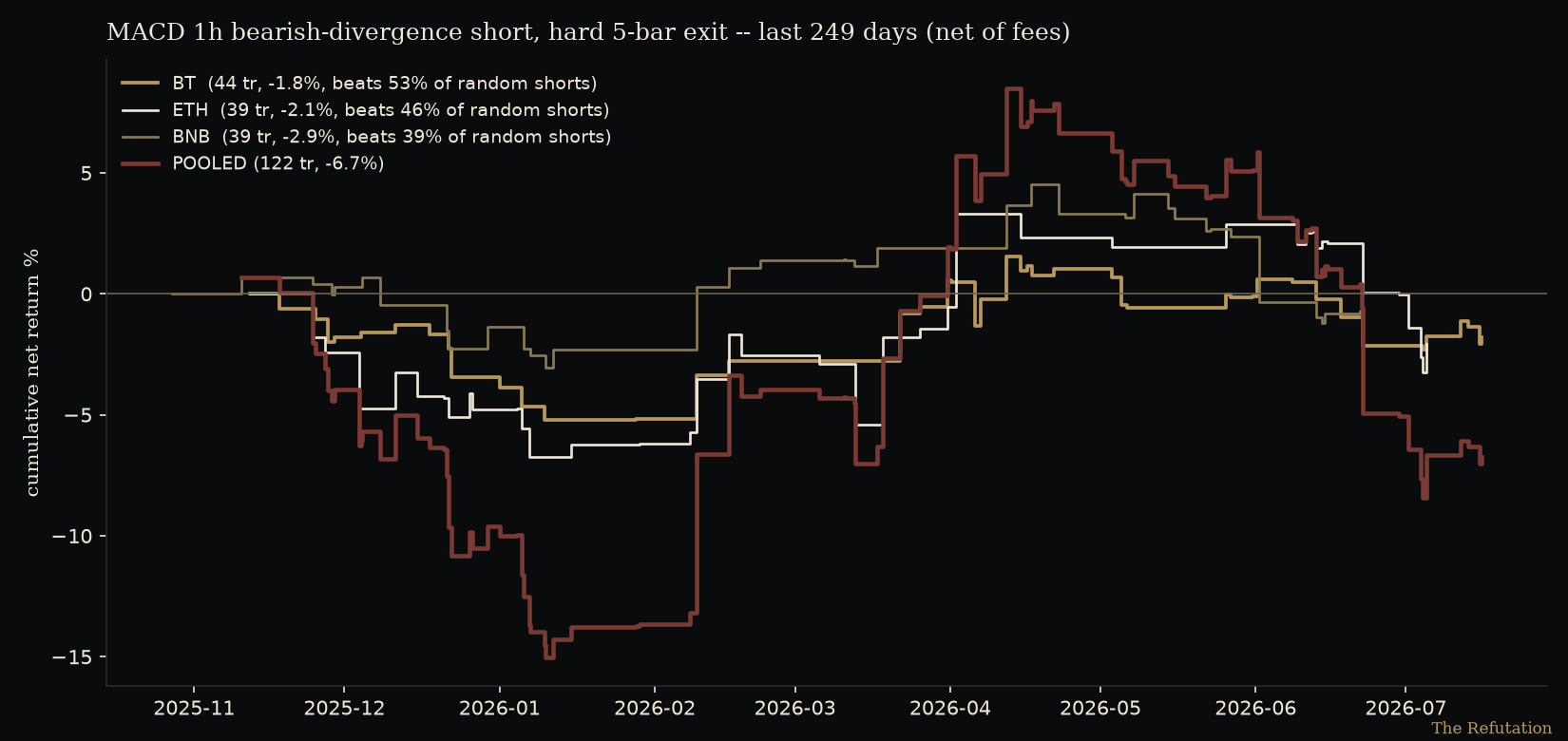
One scan produces hundreds of numbers. A few of them will always look that seductive. The question is never whether an exciting cell exists. It is whether the effect holds out of sample, across assets, across timeframes. This one held nowhere.
Tuning cannot save it
The standard objection arrives on schedule: wrong settings. So we swept a wide grid around the textbook settings, both directions, with and without the most-taught trend filter: 320 variants, all shown below.
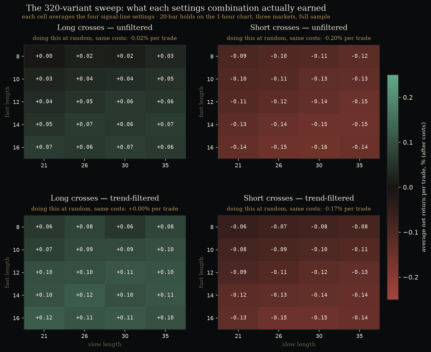
The complete textbook system, long and short crosses with re-tuned parameters, passed zero of six held-out regimes.
The reveal
One version did markedly better, and it is the most instructive result of the study.
Everyone is taught to trade MACD "with the trend", most commonly by only taking longs above the 200-EMA. That advice tests as true. The filtered system improves substantially. But decompose it and the story inverts: a random long entry above the 200-EMA captures almost all of the improvement. The MACD cross adds about a tenth of a percent, well inside noise. The filter is driving. The indicator is a passenger.
We then replaced the 200-EMA with the regime model we run internally (premium member methodology), and this produced the strongest result of anything achieved in the entire study: profitable in four of six held-out regimes, including a bear market it survived by standing aside. Four of six is the closest any system in this letter's history has come to our bar. It is still a rejection, and the two failures were honest ones: a flat bear it couldn't profit from, and the range era, where every trend filter is structurally blind and the entries bled inside it.
| Held-out era | What the market was doing | Trades | Avg per trade, after costs | Outcome |
|---|---|---|---|---|
| blow-off | vertical rally into a top | 163 | +0.22% | profitable |
| bear 1 | a long decline | 71 | +0.25% | profitable, mostly by standing aside |
| bull | steady uptrend | 240 | +0.45% | profitable, the strongest era |
| range | a dead sideways stretch | 150 | −0.33% | lost: the filter's blind spot |
| bear 2 | falling market | 55 | −0.02% | flat, no profit |
| recovery | choppy climb | 195 | +0.17% | profitable |
Table 1. Each era is graded out-of-sample: the system is tuned on the other five and walks the held-out era blind. Trade counts pool the three markets. Note the shape of the failure: it is not the bears that hurt it, it is the range, where a trend filter has nothing to read.
Read that carefully, because it is the whole article in three sentences. The entries contributed nothing anywhere. The filter contributed everything the system had. And even a good filter, churned through per-trade entries and per-trade fees, captured its own edge worse than simply holding while the filter said yes. Members will get the full workup of that regime model, including exactly where it fails, in an upcoming members' note.
The scorecard
| Prediction, written before any test | Outcome |
|---|---|
| Crosses indistinguishable from coin flip | Confirmed. 0 of 6 regimes; best cell earns less than the fee. |
| Histogram: more signals, no more information | Confirmed. Zero at 23,000 measurements; taught colour-turn points backwards. |
| Divergence zero or worse | Confirmed. Sign flips across timeframes; forward test lost in ideal conditions. |
| Filtered version better, still fails regime validation | Confirmed. 4 of 6, best in the study, failure concentrated where the filter is blind. |
Table 2. The four pre-registered predictions, graded.
What to take from this
Not that MACD users are fools. The people who profit while using MACD are, almost always, profiting from the thing standing next to it: a trend filter, a rising market, position sizing that lets winners run. The panel at the bottom of the chart is decoration on decisions being made elsewhere. That is the honest, testable content of "it works for me".
The transferable habit is the one question that did the honest work above, and it applies to every indicator you will ever meet: compared to what? Not "did it go up after the signal", but "did it go up more than it would have anyway". Most of technical analysis does not survive that one question. It is also the cheapest question in trading to ask.
Scope. These results are measured on the largest crypto markets, across the full range of chart timeframes, over the last several complete market cycles, with realistic costs. We make no claim about equities, other asset classes, or other eras. An honest result comes with its address attached.
How this was tested (so you can trust the numbers)
Textbook settings tested first, then a wide sweep around them · signals act only on closed bars · every signal is judged against the market's own drift rather than against zero · no trade is double-counted, and results are corrected for the number of variants examined · final validation re-tunes on a set of training regimes and grades only on a market era the system has never seen. The full test bench, its grids and its thresholds stay in-house.