 The Refutation
The graveyard · The autopsy
Did the Golden Cross Lose Its Shine?
Trading strategies come in and out of fashion before you ever get the chance to master one, because what works in one kind of market rarely works in the next. Did the strategy that minted money in the 1999 dot-com melt-up still work in the 2000 melt-down? Markets trend up, trend down, and grind sideways; they consolidate, reverse, or simply keel over, and their whole character can change in an afternoon. So when a signal is famous for "working," the first honest question is not does it work, it is when did it work? And would it survive a different market regime?
You've seen a golden cross. When the 50-day moving average crosses above the 200-day, the "golden cross," a new bull market is supposedly born. When the 50 falls back below the 200, the "death cross," the bear is at the door. It gets a banner on CNBC. It is in every introduction-to-charting course. It has a clean, seductive story: the recent trend has overtaken the long trend, so momentum has turned. We wanted it to be true. It isn't, and the reason is visible in a single picture.
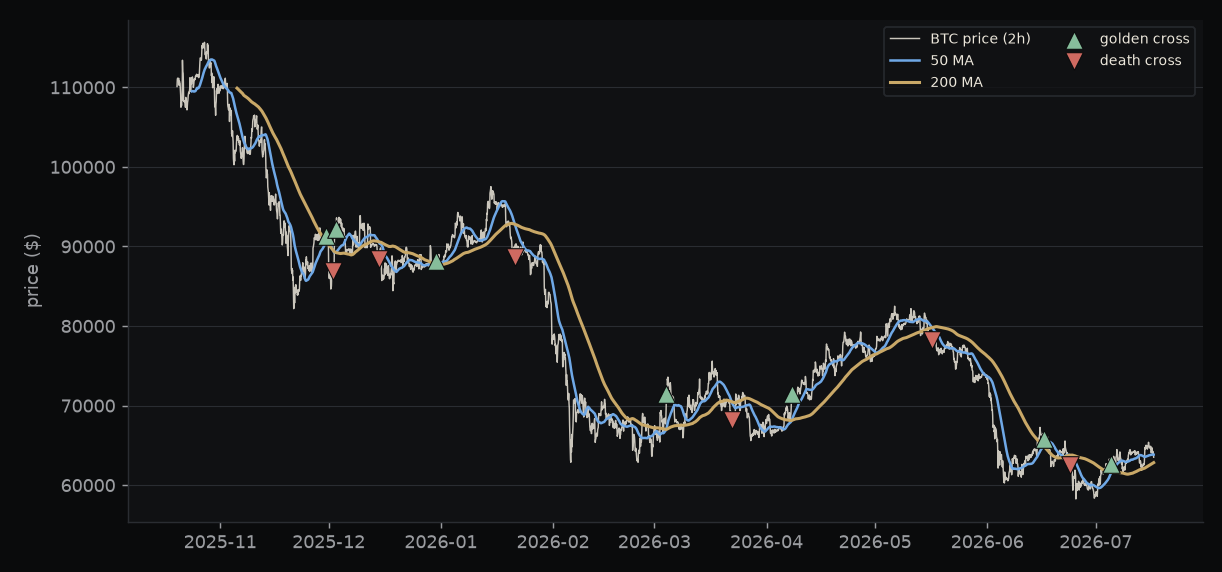
Here is what you are looking at, and why it matters. A moving average is nothing more than the average price over a run of recent bars, so both coloured lines are built entirely out of the past. That means the blue 50-line can only climb above the brass 200-line after a rally has already been running for weeks. The green "buy" triangle never marks the start of a move; it marks the confirmation of one that is mostly over. Now follow the green triangles from left to right, because it is almost comic. The signal said buy at $91,000 and $92,000 near the very top, then said buy again at $88,000, then $71,000, then $66,000, then $63,000, chasing Bitcoin all the way down from $90k to $60k. Every red triangle, the "get out," lands well after the drop. In a market that chops or grinds lower, the two lines keep crossing back and forth, and each crossing hands you a late instruction that reverses on you almost immediately.
The obvious objection is that we picked the wrong version. Use the daily chart. Use a stop. Take profits. So we didn't test one golden cross. We tested hundreds, changing one thing at a time so we could see what actually moved the result.
No timeframe, no stop, saves it
First we pinned the 50/200 pair and varied only two things: the timeframe the cross is measured on (from 5 minutes up to 4 hours) and how much room we gave a losing trade before we cut it (a 1% to a 5% stop). Thirty combinations in all.
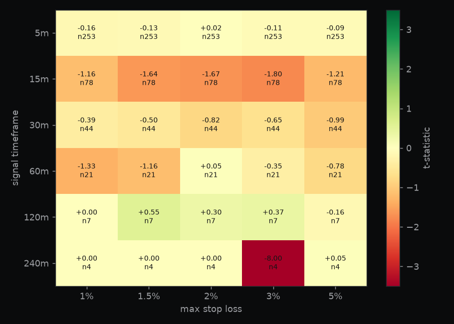
Read it like a scorecard. Each square is one version of the strategy: pick a row for the timeframe and a column for the stop size, and the colour tells you how that version did. The score inside each square is a t-statistic, which is just a measure of whether a result is real or only luck: below 2 you cannot tell it apart from a coin toss, above 2 is the usual bar for "probably real." Green would be a genuine edge, red a dependable loser. If the golden cross truly worked, we would expect to see one strong green square with gently weaker green around it, a little hill you could plant a flag on. Instead the whole board is a wash. The single best square out of thirty scores +0.05, which is a coin. Worse, the slightly-better and slightly-worse squares are scattered with no pattern at all, and no pattern is exactly what pure noise looks like. Widening the stop (moving to the right) only makes the losses a bit smaller by cutting fewer trades short; it never turns a red square green. There is nothing here worth throwing good money after.
The one corner that tempted us (and why it's a trap)
There was a single patch that lit up, and we are showing it to you precisely because it is the trap this whole letter exists to expose. On the two-hour chart we took the same 50/200 cross and this time swept the exit: how long to hold the trade, against where to take profit. Sixty combinations, and one of them finally glowed green.
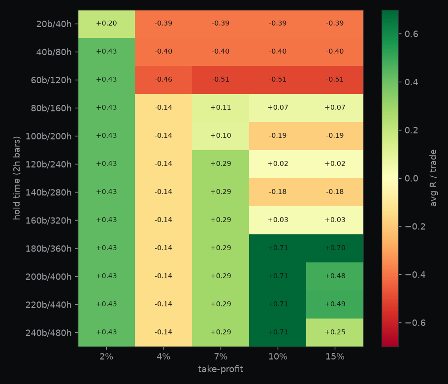
That green patch, sitting at the longer holds and a 10% profit target, showed an average of +0.71R per trade. "R" just means reward measured against what you risked, so +0.71R is a trade that on average returns 0.71 times the amount it put on the line, and that is the sort of number that makes people reach for the buy button. Then we looked closer, and it dissolved in our hands. The two-hour golden cross only fires about seven times in nine months, so all sixty of those squares are the same seven trades, exited sixty different ways. With only seven results you can always find a hold time and a profit target that would have worked, in exactly the way you can draw a straight line through any two dots and call it a trend. That "winning" patch actually wins just 29% of the time; its entire edge rests on one lucky trade that happened to run for two weeks. It is not a strategy. It is a memory of the past wearing the costume of a plan for the future.
The test that can't be gamed
To be sure we weren't fooling ourselves, we ran the golden cross through the test we trust most: leave-one-regime-out. Take six distinct market eras (three bull markets of different character, a grind-sideways range, and two bears), tune the strategy's best settings on five of them, then score it on the sixth, the one it has never seen. Rotate, so every era gets its turn as the unseen test. A real edge survives on the era it was not tuned for, and the bar to clear is five of the six.
Because a signal like this can behave differently at different speeds, we did not run that gauntlet once. We ran the whole thing separately on every timeframe, from 5 minutes to 4 hours.
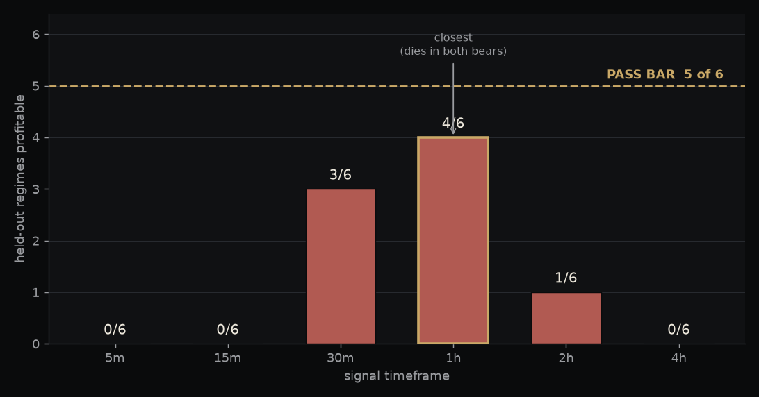
Not one timeframe survives. The best is the one-hour, and even it reaches only four of six, failing in both bear markets: a long-only signal getting run over at exactly the moment it is supposed to protect you. The famous slow frames are worse, not better. The two-hour manages one of six, and the daily-scale four-hour cannot find settings that hold up in training at all. Speed it up to 5 or 15 minutes and it is zero of six. Wherever you look, the same verdict: the golden cross does not survive a market it was not tuned on.
"But it beat buy-and-hold"
This is the last place a dead signal hides, so we went there too. And yes, we can even show you a version that made money.
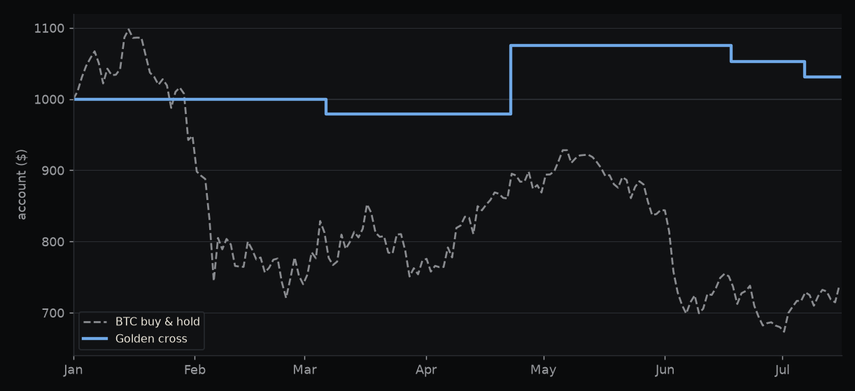
The blue line is $1,000 handed to the strategy on New Year's Day; the grey line is the same $1,000 just left sitting in Bitcoin. The strategy ends the period up 3.1% while Bitcoin itself fell 26%, blue riding comfortably above grey, and a newsletter chasing your subscription would freeze the frame right here. But look at what actually happened underneath that line. The strategy made only four trades all year and spent roughly two-thirds of the time holding nothing but cash. It "beat" Bitcoin by standing on the sidelines while Bitcoin fell, and its slim gain came from one lucky winner that paid for three losers. Sitting in cash through a crash is not a trading edge; it is a side effect of a signal that almost never fires. Now turn the market the other way up: had Bitcoin risen 26% instead of falling, those same four trades would have left you trailing far behind it. Beating a falling market by mostly not being in it tells you nothing about whether the signal works.
Why it fails, stated plainly
- It is late by construction. A cross of two backward-looking averages can only confirm a move after it is already underway. The name promises a starting gun; the math delivers a rear-view mirror.
- It whipsaws. In anything but a clean one-way trend, the two averages cross back and forth, generating buys into the very declines they are meant to avoid. Figure 1 is that failure, seven times over.
- Its one good era is a tautology. Long-only trend-following makes money in a bull market whether or not the signal has any skill. Crediting the cross for a bull market is crediting the rooster for the sunrise.
- The famous version is untestable on purpose. On the daily chart it fires maybe once or twice a year, so its believers are working from a handful of examples: exactly the sample size where luck looks like law.
The verdict
The golden cross is what we call a lagging indicator, which is a polite way of saying it tells you after the move has happened. So the answer is no: the golden cross is not a trading edge. It is a shiny name bolted onto a backward-looking average, kept alive by a good story and by firing so rarely that nobody ever gathers enough evidence to bury it or even to question it properly. It will keep "working" in bull markets, which is to say it will keep taking credit for trends that any long position would have caught. We went looking for the version that survives an honest, out-of-sample test across timeframes, stops, exits, and six market eras. There isn't one.
That is the job of this letter: to tell you which famous things are real, and which are only famous. Access The Survivors, the strategies that do hold up, for about the cost of a month's brokerage.
How this was tested (so you can trust the numbers)
BTC 1-minute data resampled to each tested timeframe · entries at the next bar's open, never at a price the strategy couldn't have traded · fees charged on every trade · stops and targets filled honestly against the real bar high and low, with no phantom fills · one position at a time, so no overlapping-trade double-counting · the 50/200 pair held fixed throughout; only timeframe, stop, hold and target were swept, and every grid is exploratory, so read the pattern and not the single best box · out-of-sample verdict via leave-one-regime-out across a six-era library of matched bull, bear and range windows, pass bar five of six · the $1,000 curve uses the in-sample-best settings and is shown to make a point about benchmarks, not as a track record · t-statistic = mean ÷ standard error.